Website design
Tools
Figma
Team
Stefan Greif (Product Manager)
Daniel Aigeldinger (Martech Manager)
Role
Led the UX redesign of the Events experience, focusing on information hierarchy, filtering, accessibility, responsive behavior, and scalable event browsing patterns. Worked closely with Stefan (PM), developers, and stakeholders throughout concept exploration and handoff.
Project details
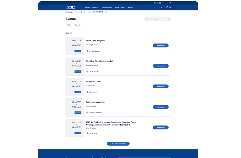
The KS Events platform is used to manage and showcase webinars, conferences, workshops, and medical training sessions across multiple regions and specialties. Events could be online, on-site, or hybrid, making discoverability and accessibility critical for users such as doctors, sales representatives, and medical partners.
The existing experience became increasingly difficult to navigate and maintain.
Problem Statement
Business Challenge
The existing platform struggled to support efficient event discovery at scale.
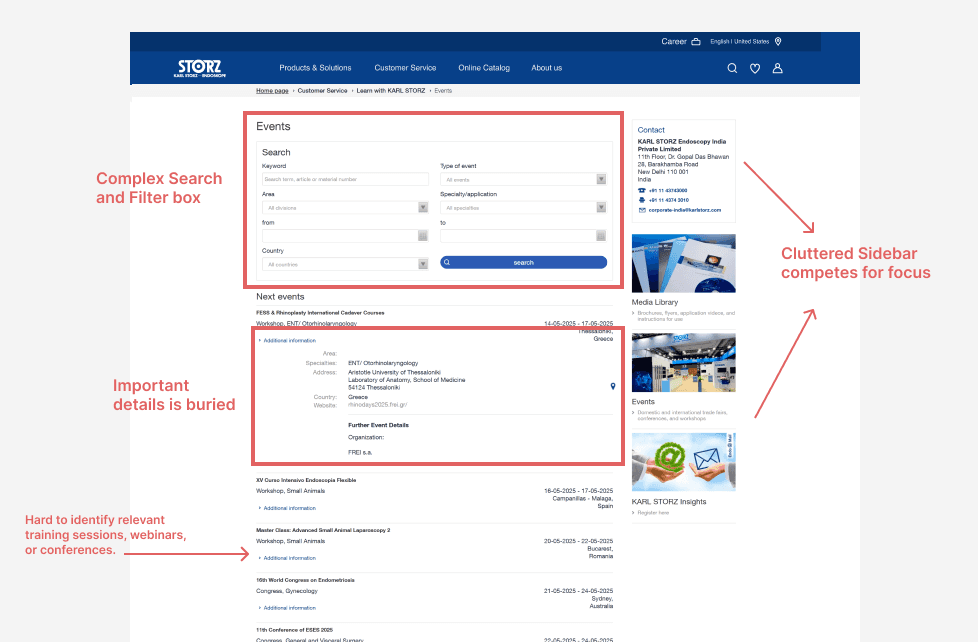
Outdated layouts, dense filtering, and fragmented event visibility made it difficult for users to quickly browse and access relevant events.
The experience also needed to evolve while staying aligned with the existing KS design system and enterprise standards.
User Challenge
Users had difficulty scanning upcoming events due to limited visibility of important details such as dates, format, and location. The filtering experience occupied significant screen space, navigation required excessive interaction, and users often had to open individual event pages just to access basic information.
This created friction for users trying to quickly identify relevant training sessions, webinars, or conferences.
Approach
The redesign process focused on identifying friction in event discovery and reducing unnecessary interaction.
Using stakeholder feedback, analytics insights, and competitive analysis, I explored multiple layout directions before presenting two design pathways for review and alignment.
The final direction focused on improving scanability, reducing visual clutter, and making important event information accessible earlier in the browsing experience.
Key UX Decisions
Improved event visibility
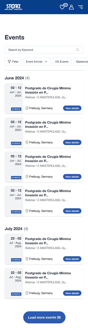
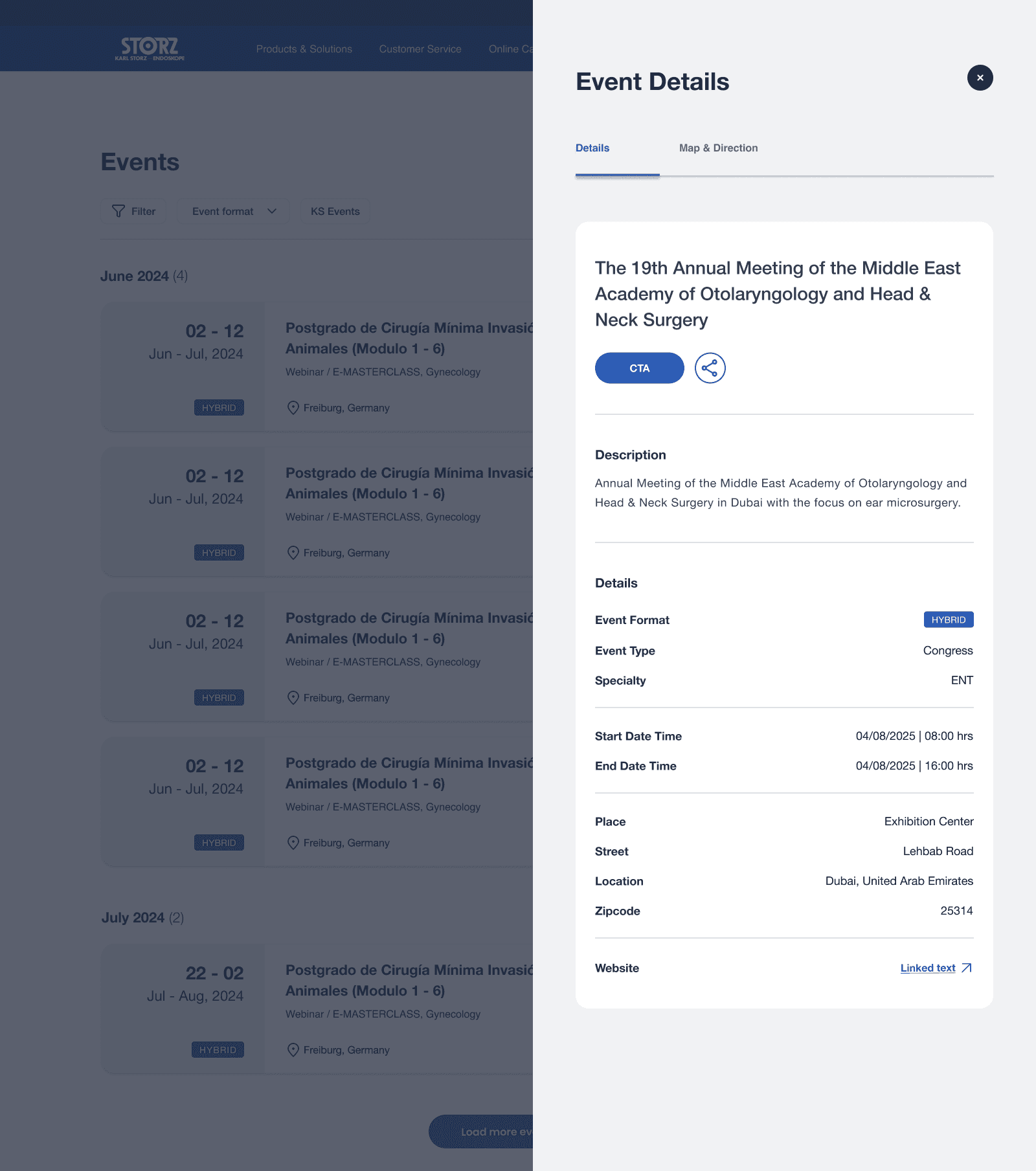
Event cards were redesigned to surface critical details such as event dates, location, and format directly within the list view.
Reduced interaction cost
Users no longer needed to open individual event pages to understand basic event information, significantly reducing unnecessary clicks.
Modernized filtering experience
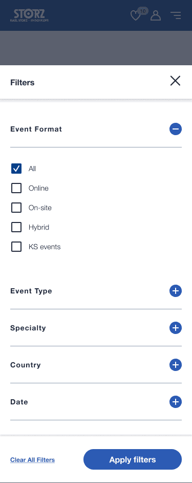
Filtering and search were simplified and reorganized to reduce screen usage while improving discoverability.
Responsive and accessible layouts
The experience was optimized across screen sizes with improved spacing, hierarchy, and accessibility considerations.
Slide-out event details
Introduced a side-panel interaction pattern that allowed users to quickly preview additional event information without fully leaving the browsing flow.
Scalable component structure
Designed reusable event card and filtering patterns aligned with the KS design system for future scalability.




Results
The redesign improved how users browse and evaluate events by surfacing critical information earlier in the experience. Event dates, formats, and locations became easier to scan directly from the listing view, reducing the need for repetitive navigation.
The updated layouts simplified filtering, reduced visual clutter, and created a more structured browsing experience across devices. The final direction was approved by stakeholders and launched as part of the updated KS web ecosystem.
Reflection & Learning
This project strengthened my understanding of designing within company constraints and existing design systems. Rather than reinventing the experience visually, the focus was on improving usability, scalability, and discoverability through thoughtful UX decisions.